
RISD ID Website Redesign
Redesigning how students discover and engage with RISD ID online
Team
Tom W. (Supervisor) Leslie F. (Supervisor)
Contributions
Lead Designer
TOOLS
Figma Framer
Contract
Time
2025
Introduction
The RISD Industrial Design (ID) department’s website serves as its primary digital face for recruitment and internal communication. However, the existing site suffered from broken navigation, accessibility bugs, and sparse content.
I discovered the problem, proposed solutions, and led a redesign to transform the platform into a dynamic, maintenance-friendly hub that centralizes resources and showcases student work.
The Problem
Despite the department's world-class reputation, its digital presence lagged behind. An audit and competitor analysis identified three critical issues:
Low Student Visibility: Unlike competitor programs, the site lacked a dedicated gallery to showcase student projects.
Usability Failures: The site was plagued by broken buttons, inconsistent formatting, and a convoluted Information Architecture.
Maintenance Debt: The complex Squarespace system discouraged staff updates and resulted in stale content.
Research
Interviews with 10 undergraduate students revealed a key pain point beyond the audit findings: scattered resources.
Students struggled to locate basic information like shop hours and often relied on chat logs or camera rolls to find them.
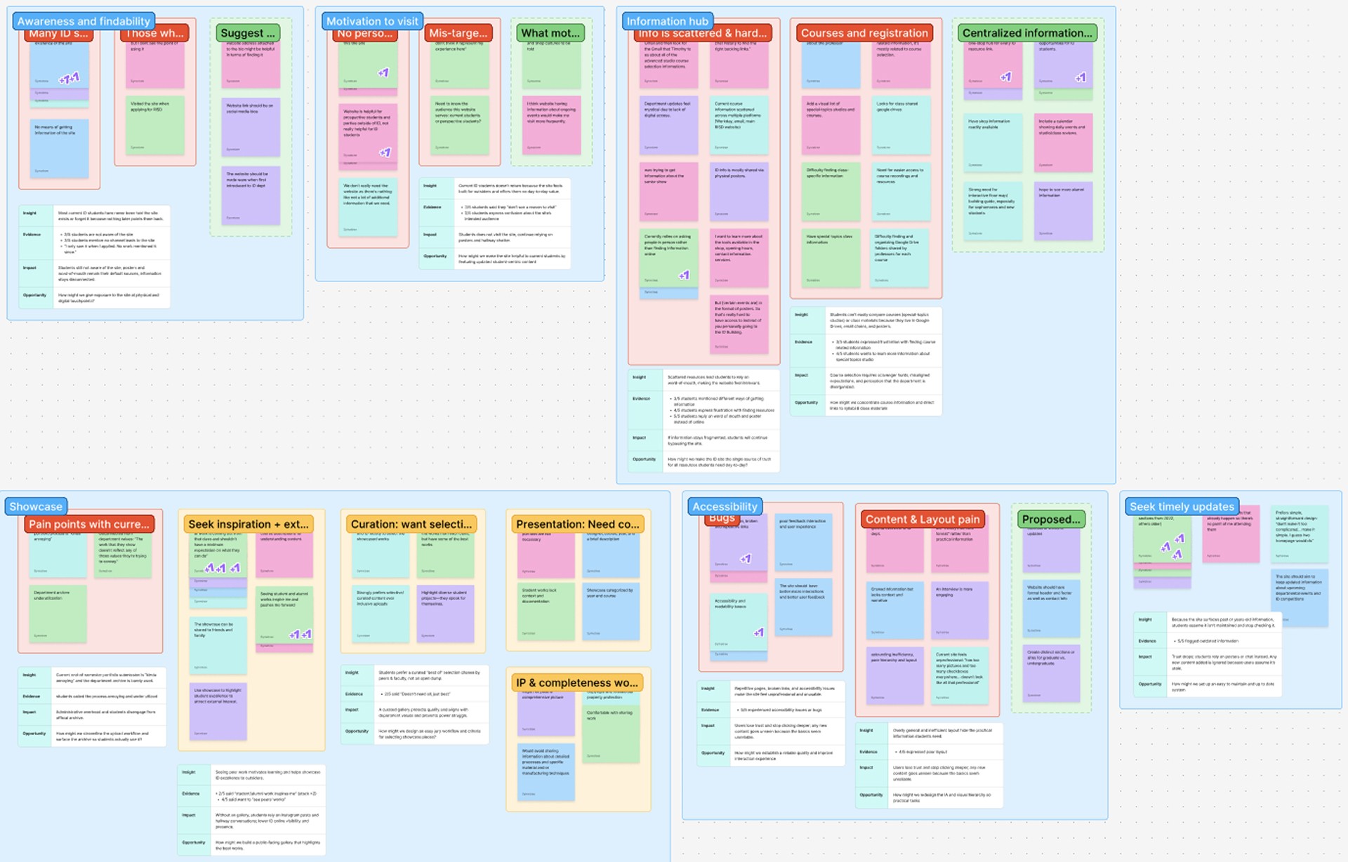
Insight: The website should function as a centralized information hub rather than a simple showcase of student work.
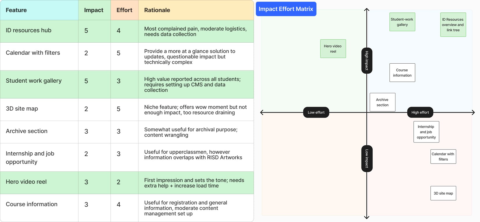
The Challenge
Balancing diverse stakeholder needs with strict constraints defined this project.
Undergraduate students, graduate students, and faculty held conflicting priorities for the site. Additionally, we faced a limited summer timeline and a tight budget.
We selected a low-code approach for efficiency, though this restricted feature complexity. To navigate these limitations, we prioritized high-impact features that balanced functionality with feasibility.
The Solution
We selected Framer to replace the existing Squarespace setup. This offered superior customization and a user-friendly CMS at a lower cost. Key design decisions included:
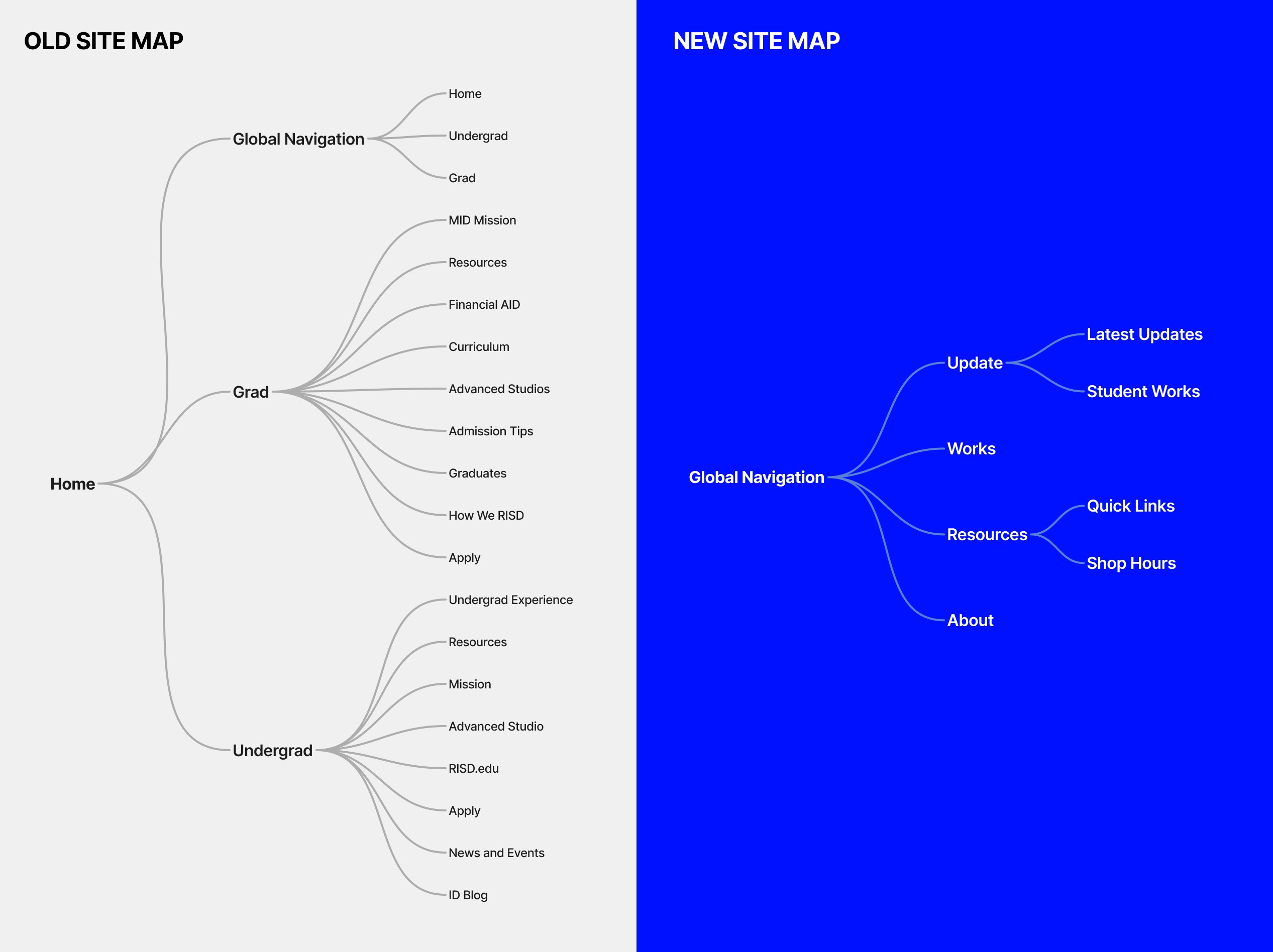
A. Simplified Information Architecture
I streamlined the previously maze-like sitemap into a lightweight, accessible structure. This improved navigation clarity and significantly reduced maintenance effort.
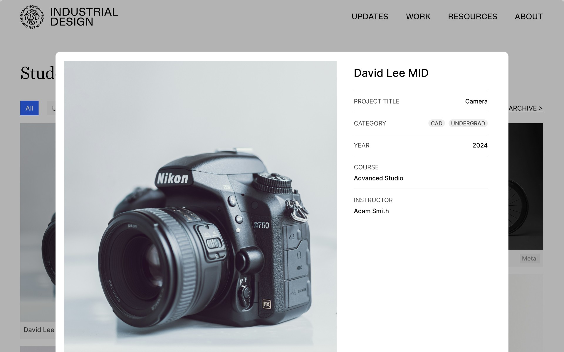
B. The Works Showcase
I designed a masonry-style gallery with a custom CMS. Users can filter by program to view work, student details, and graduation year.
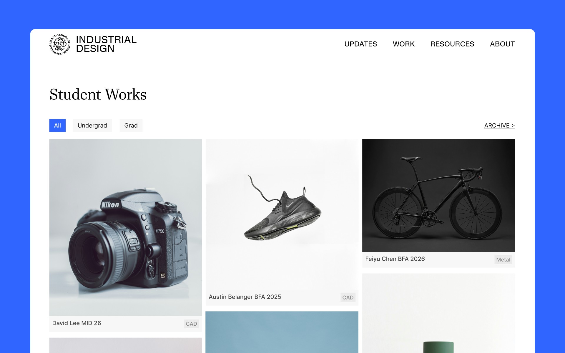
Automated Styling: The CMS automatically styles project entries. Staff can now add new projects in under five minutes via a simple form.
C. The Updates Feed
The landing page now prioritizes upcoming events rather than past ones, addressing user feedback that "old events are useless".
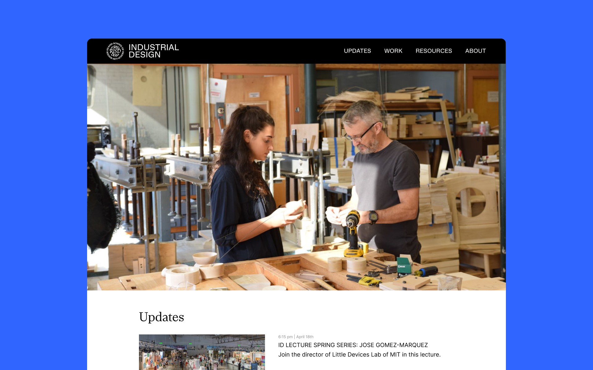
We integrated a hero video on the landing page featuring shop/studio footage to immediately immerse visitors in the physical making process of the department.
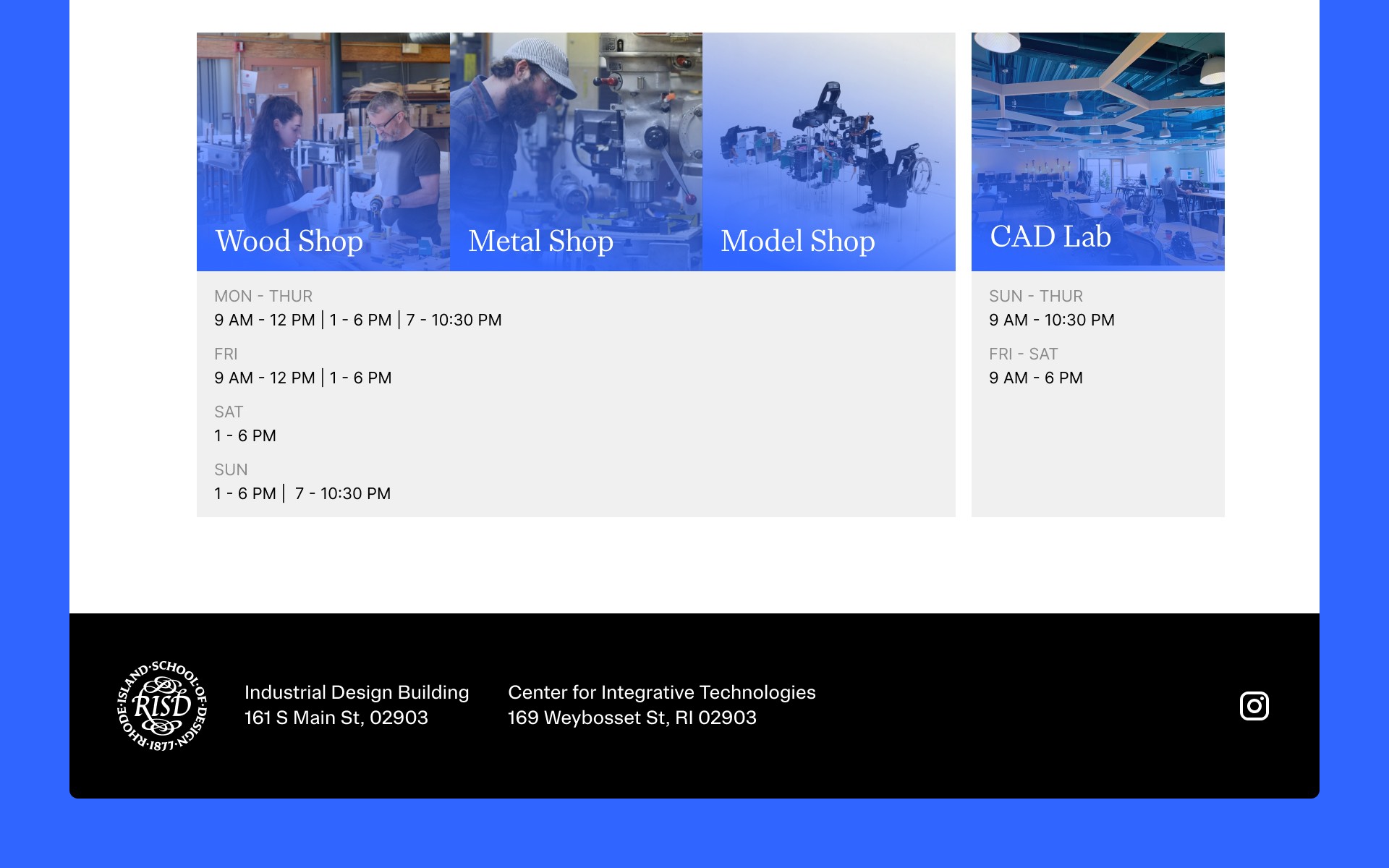
D. Resource Hub
I consolidated frequently accessed links and shop hours into a single, quick-access page. This resolved the "scattered resources" pain point.
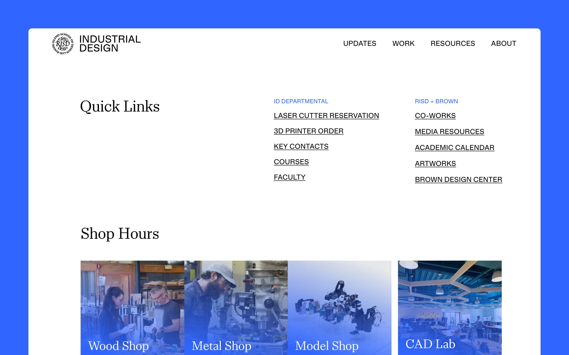
Shop hours can also be seen below the quick links. I organized the opening hours and presented in a simple, scannable layout.
Outcome
The website launched successfully on a $1,700 budget. I am currently refining the site based on student feedback. Concurrently, I am developing a more efficient system for gathering student work to ensure the platform's long-term sustainability.
Reflection
This project taught me how to balance conflicting stakeholder requirements and deliver a viable product under strict time and resource constraints.