
ArchNexus App
Designing a platform that gives users access to multiple AI models in one place
Team
Kevin Z (Developer)
Contributions
Founding UI/UX Designer Co-Founder
TOOLS
Figma
Startup
Time
2025
Introduction
ArchNexus is a platform that gives young adults access to all the best AI models with pay-as-you-go pricing. Unlike subscription-based competitors that lock users into one service provider, ArchNexus prioritizes flexibility, transparency, and exploration.
My role as the sole designer on the team is to design the end-to-end user experience and interface.
Problem
As users ourselves, here are some assumptions from our personal experience:
AI is overpriced: Most users don’t use enough volume to justify $20+/month subscriptions.
Subscriptions discourage exploration: Users are tied to one provider and can’t explore the right model for their use case.
Best AI models are gatekept: Advanced models are barred behind premium plans.
Research
User Research
I began interviewing peer students, here's what we found:
Most students use two tools, but most subscribe only to one, which the majority is ChatGPT.
Students use AI tidally, usage spikes during midterms and finals.
This means that most students likely only pay for one service (if any). They are not model hopping because they don't want to pay $20/month for a second or third similar service that they view as redundant. So what if we create a platform that gives the freedom to choose what AI model to use and how they pay for it?
Competitive Landscape
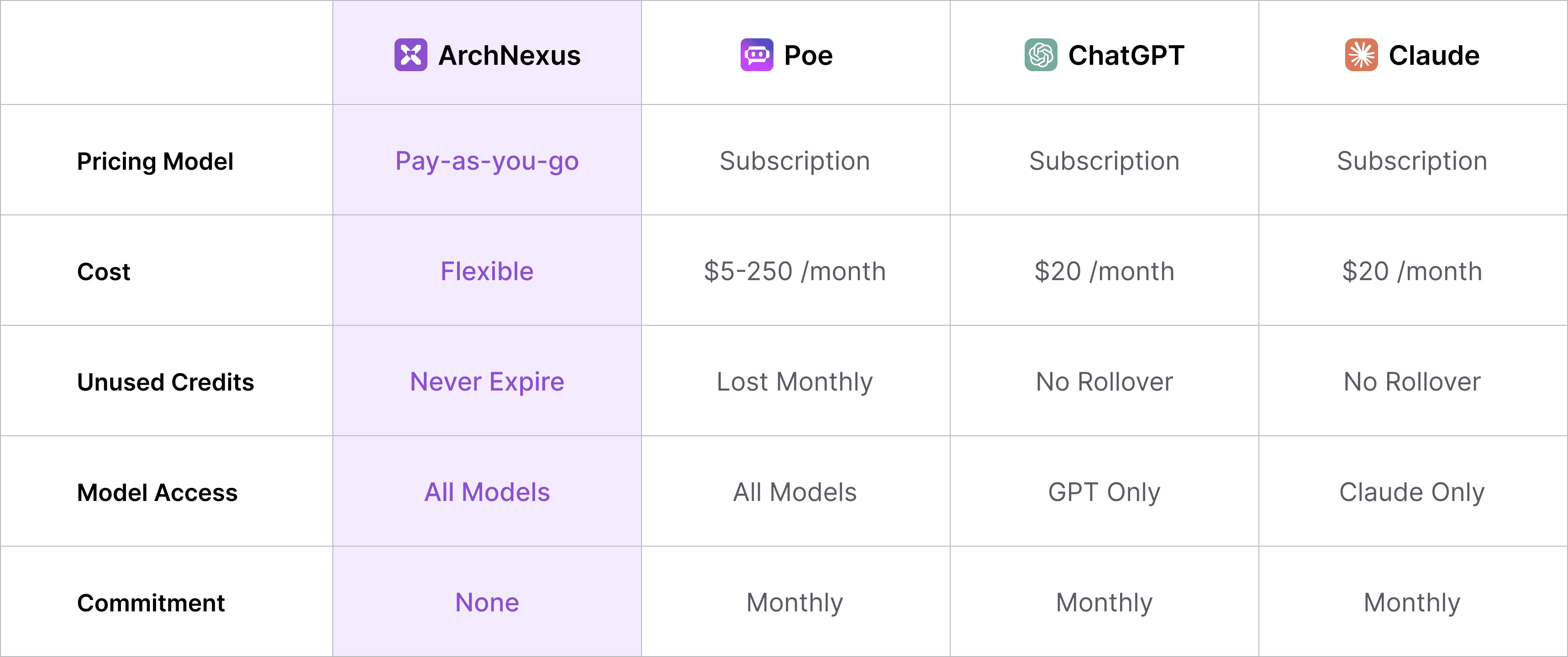
Competitors either lock users into a single LLM or force them into flat-fee subscriptions. We aim to give choice and flexibility for cost-conscious users who want power without overpaying.
Design Goal
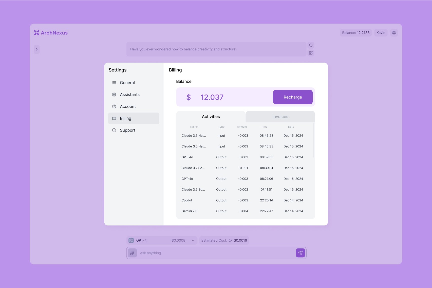
Transparency → show real-time cost and usage at a glance.
Flexibility → enable seamless switching between models/providers.
Clarity → simple onboarding, minimal jargon, user-first flows.
Iterations
Wireframing

Early sketches explored token cost dashboards and model-switching workflows. I tested low-fidelity wireframes with target users to validate flows.
Before & After

At first we designed to implement token system to simplify pricing calculation to reduce cognitive load, yet users feedback mentioned preferring transparency and feels token system to be scummy. We thus removed the token and shows the detailed cost breakdown so that users know how they are being charged.

We observed that users have to go through multiple clicks after a response to compare models and perform other relevant actions, so we modified the response to have a quick action tool belt that allows users to compare models and regenerate more easily.
Outcome
Deliverables
Full design system + UI prototype
Branding + product positioning
Collaboration with developers for a fully functional MVP
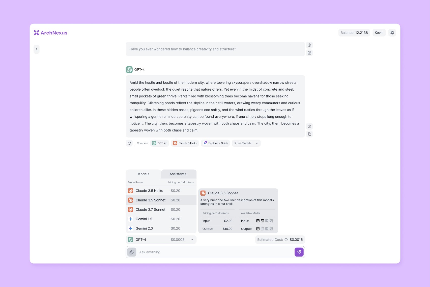
Quick access tool bar for more control and convenience with the response.
Scan friendly model switcher for jumping between AI models quickly.
Dashboard with cost transparency (see usage + spend in real time).
Roadmap
ArchNexus is now in closed beta. We are mostly ready to launch but are still testing more usability and polishing the experience.
Reflection
I'm incredibly grateful for my partner in crime Kevin, whose coding made this entire project possible. There are so many things we learned in the process of building ArchNexus, here are some of the best:
Developer-designer collaboration: Working with Kevin the full-stack developer has helped me understand some of the best practices for optimizing design for dev handoff.
More features are nice, but priority matters: We originally envisioned the app to have more features and available on more devices, but soon realized that getting a MVP out is more important.
The Barrier of Familiarity: Even when a current solution is imperfect, users prefer the predictability of their existing tools over the friction of onboarding to a new platform.